Working on a little Twitter research that is sooner or later going to be materialised in a form of an article, a phd-thesis, booklet or website, I found and put together some numbers to reveal the basic pattern of Twitter growth. It looks like the great expansion of Twitter has began in 2011.
The big expansion since 2011
Based on some official data revealed by the Twitter, Inc., unofficial numbers and estimations available online[1] I made a visualisation of how Twitter expanded in the years 2006-2013.
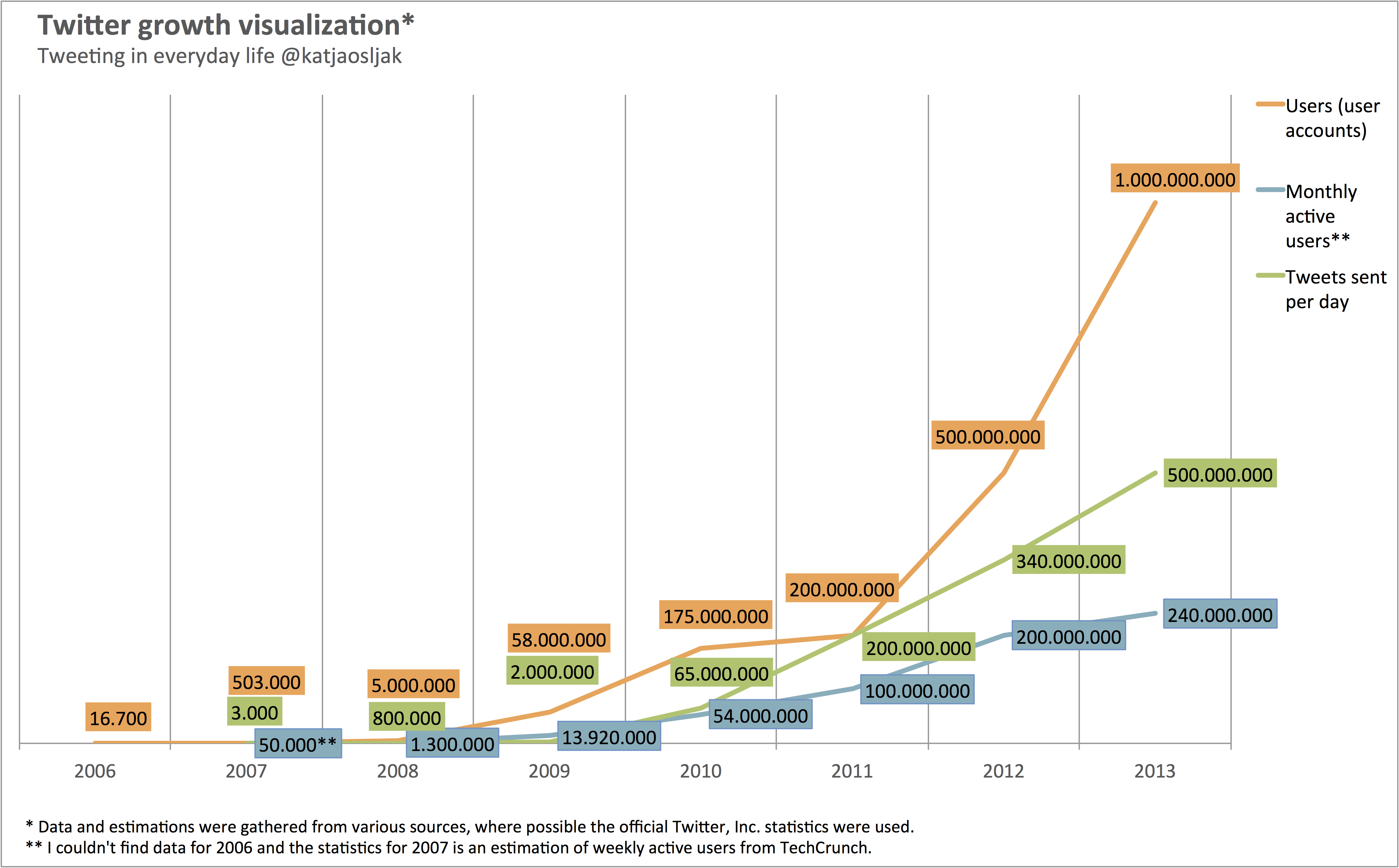
Since 2011 Twitter has been growing rapidly. In just 2 years total users number jumped from 200 million to 1 billion Twitter users. Of course, Twitter went public in 2013 and a billion user database sounds quite impressive! But the estimated count of monthly active users grew slower in that period, increased for “only” 240% and reached 240 million in 2013. One reason for a less steep progress line of active users growth might be less effective retention building in comparison to an aggressive goal-driven user acquisition and recruitment.
ps: Is it possible that in 2011 every Twitter user posted in average one tweet per day? I’d rather believe that some data have been gathered in different periods of the year and misplaced or misinterpreted; + sometimes isn’t completely comprehensive, whether the available statistics and estimations refer to Twitter unique visitors or registered Twitter users.
[1] The visualized data has been collected from various sources, some from official statistics revealed by Twitter, Inc. completed with estimations from experts, media and bloggers covering the field of social media – all listed here:
- Twitter Reports Fourth Quarter and Fiscal Year 2013 Results
- KISSmetrics’ Twitter Statistic
- Twitter reveals it has 100m active users
- 11 New Twitter Facts, Figures and Growth Statistics plus
- There are now more than 200M monthly active @twitter
- New Tweets per second record, and how!
- 200 million Tweets per day
- Number of monthly active Twitter users worldwide
- Twitter Hits Nearly 200M Accounts
- Twitter Added 30 Million Users In The Past Two Months
- Twitter Data Analysis: An Investor’s Perspective
- Wiki/Twitter
- End Of Speculation: The Real Twitter Usage Numbers
- Twitter Press Site
One reply on “Twitter growth visualization”
[…] Among the users from the sample 2009 seems to be the year to sign up, since 26% signed up for the service five years ago. In 2008 19% became Twitter users, in 2010 18% of them started using Twitter and in 2011 another 15% signed up for this network. — It’s not exactly the same type of data, but it might be interesting to compare the line of recruitment among the surveyed users with the visualization of Twitter growth. […]